Context
Backdoor needed a marketplace presence that could carry a high-contrast visual identity while still making the product path obvious. The old direction had enough energy, but the experience needed stronger structure: what is being offered, why it matters, and what the visitor should do next.
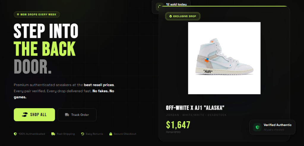
Nexus framed the page like a premium storefront rather than a generic landing page. The design emphasis is product confidence: strong imagery, compact copy, visible trust cues, and fewer distractions between discovery and checkout.
Workflow Problems
The page needed to solve practical issues that directly affect sales and support:
- Clarify the marketplace offer before asking visitors to browse or buy.
- Make product cards, featured drops, and checkout actions feel like one system.
- Use the visual identity without letting neon styling overpower readability.
- Keep the layout easy to extend as more products, categories, and campaigns are added.
 Marketplace visual direction
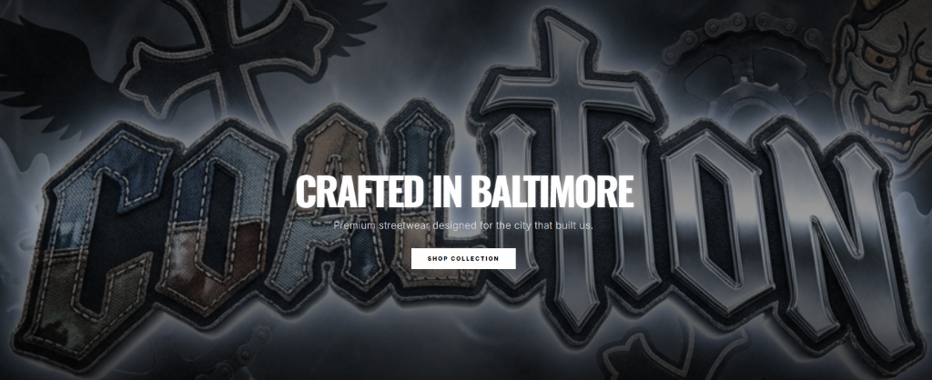
 Brand mark treatment
What Changed
The experience was reorganized around a clearer storefront story: opening brand signal, featured products, concise offer language, and a direct conversion path. The design keeps the dark, high-energy identity, but uses spacing and contrast so the page scans cleanly.
The result is a more useful marketplace foundation. It gives the brand room to run drops, promote products, collect interest, and expand without rebuilding the whole experience each time the offer changes.
Next Build Pass
The next useful step is operational: connect product data, payment handling, order notifications, and simple content management so the marketplace can be updated without editing code for every drop.